Enhancing Retail Ops with a Smart Back-Office System
( Receiptly)
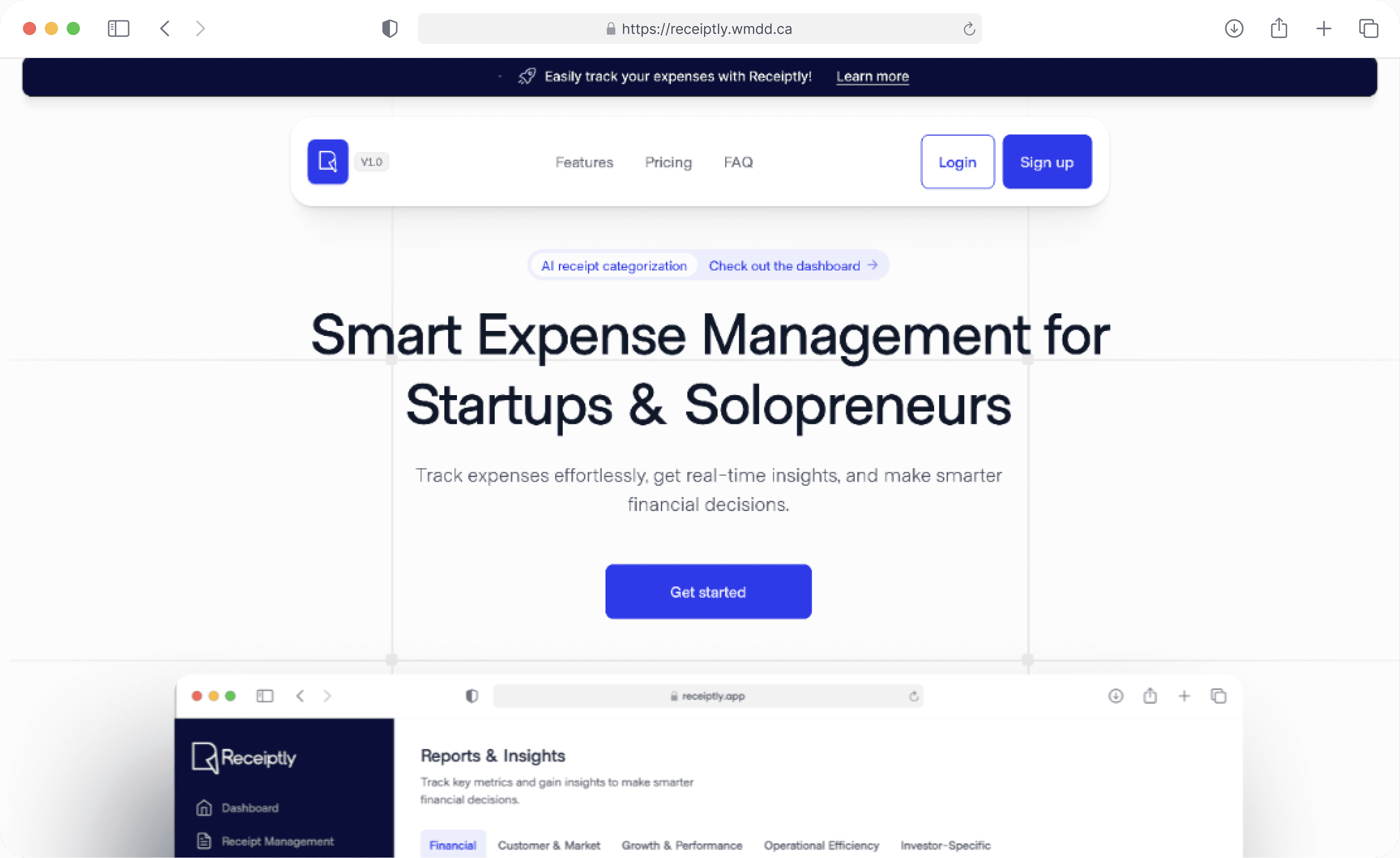
Receiptly is a smart receipt and expense tracking tool built for startups. From quick receipt capture and AI-powered categorization to investor-ready reporting.
MY ROLE
TEAM
DELIVERABLES
time line
Understanding the Problem Space
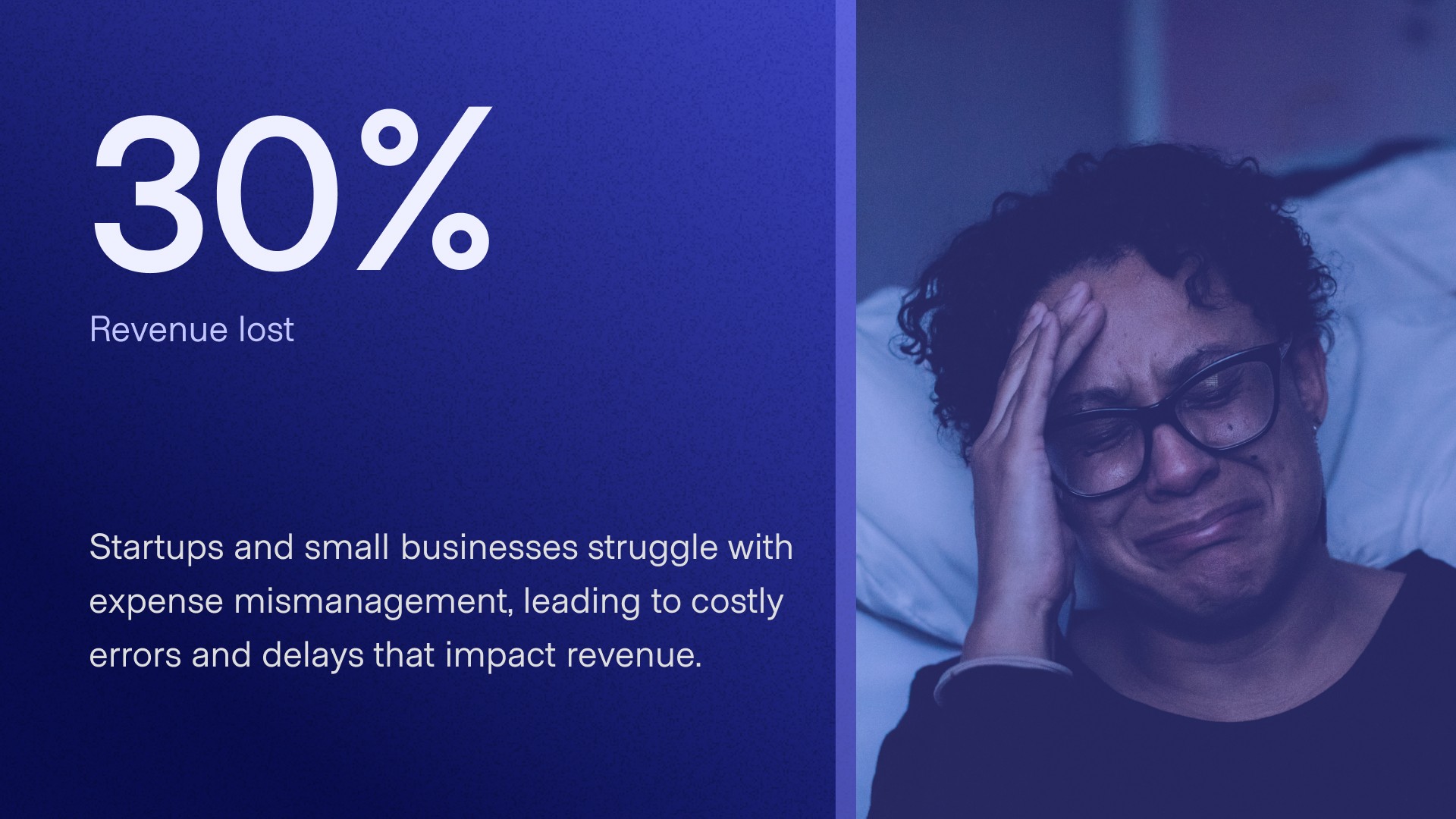
Startups and small businesses lose up to 30% of revenue due to expense mismanagement, a result of lost receipts, manual errors, and time-consuming reporting processes.
For many, the tools available are too complex, leading to costly delays and frustration. This presented an opportunity to design a product that reduces cognitive load, restores financial clarity, and empowers users to feel confident and in control, even under pressure.
The Solution: Why is managing receipts still this painful for startups?
Startups told us the same thing: receipts pile up, reports take hours, and nothing feels simple.
So we designed Receiptly to be a founder’s quiet assistant, fast, visual, and smart.
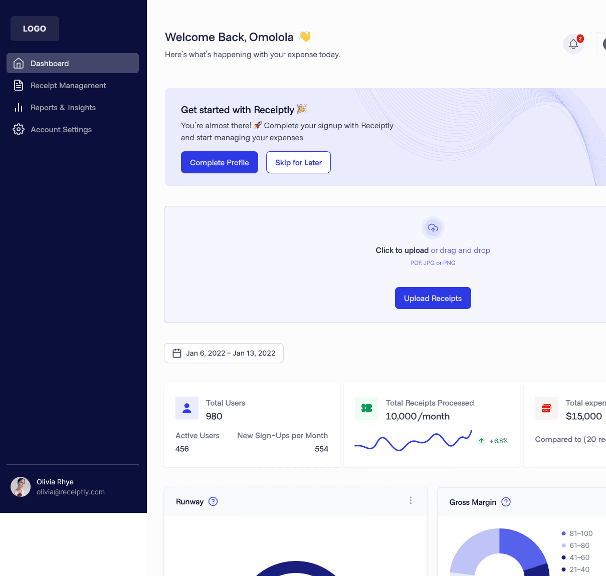
We made it easy to snap, forward, or upload receipts in seconds. Our AI learned how users categorize, improving accuracy with every correction. Dashboards became clearer, alerts more helpful, and investor reports just one click away.
Managing expenses no longer feels like a chore, it feels like progress.
Product Thinking: From Tracker to Trust Builder
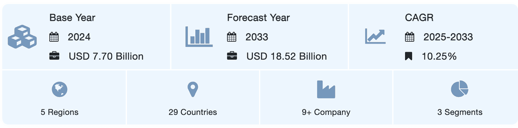
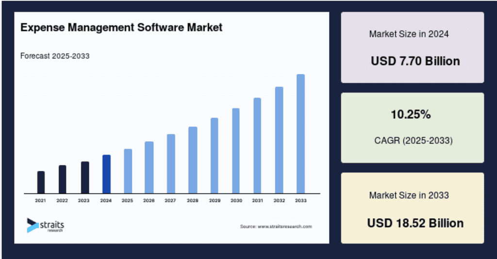
The global expense management software market was valued at $7–8 billion in 2023 and is forecasted to exceed $15 billion by 2031, with a CAGR of up to 16%.
This growth reflects a rising demand for lightweight, automated financial tools, especially among startups and small businesses aiming to simplify their reporting and investor communications.
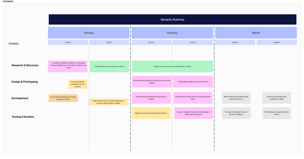
UX Approach & Ownership
To ensure alignment across design, engineering, and product, we structured our work into six bi-weekly sprints from January to March.
This roadmap was designed to guide the team from discovery to near-launch readiness, with clear milestones for validation, iteration, and delivery.
Challenges I Faced as PM & UX Designer
Wearing both the product management and UX design hats meant I had to balance user empathy with business priorities, while also steering the team toward delivery.
Here are two key challenges I encountered, and what I did about them
Leading Through Ambiguity
Challenge:
As both PM and UX lead, I had to make high-stakes calls quickly, on roadmap, scope, and UX direction. But I tend to lean toward perfectionism, often needing time to reflect deeply. The team, however, needed rapid clarity to move forward sprint by sprint.
What I Did:
I learned to embrace “clarity over certainty”, making just-enough decisions early, and setting checkpoints to revisit them. For instance, when deciding between two onboarding flows, I picked one quickly based on priority metrics and promised the team we'd test and pivot after the next usability round. This approach built trust, kept us moving fast, and gave space for iteration.
Balancing Scope with Vision
Challenge:
Early in the project, some team members, especially from the dev side, pushed for a reduced MVP. There was resistance to including features like receipt auto-categorization and smart investor reports, with the argument that these would take too much effort for an unlaunched product.
What I Did:
I facilitated a problem-first design sprint, inviting devs and stakeholders to co-define user pain points before jumping into feasibility talks. By presenting real feedback (“I need to show clean numbers, not just expenses”), I was able to reframe these features not as nice-to-haves, but as core to the product’s value proposition. This helped shift our approach from “What can we build?” to “What must we solve?”
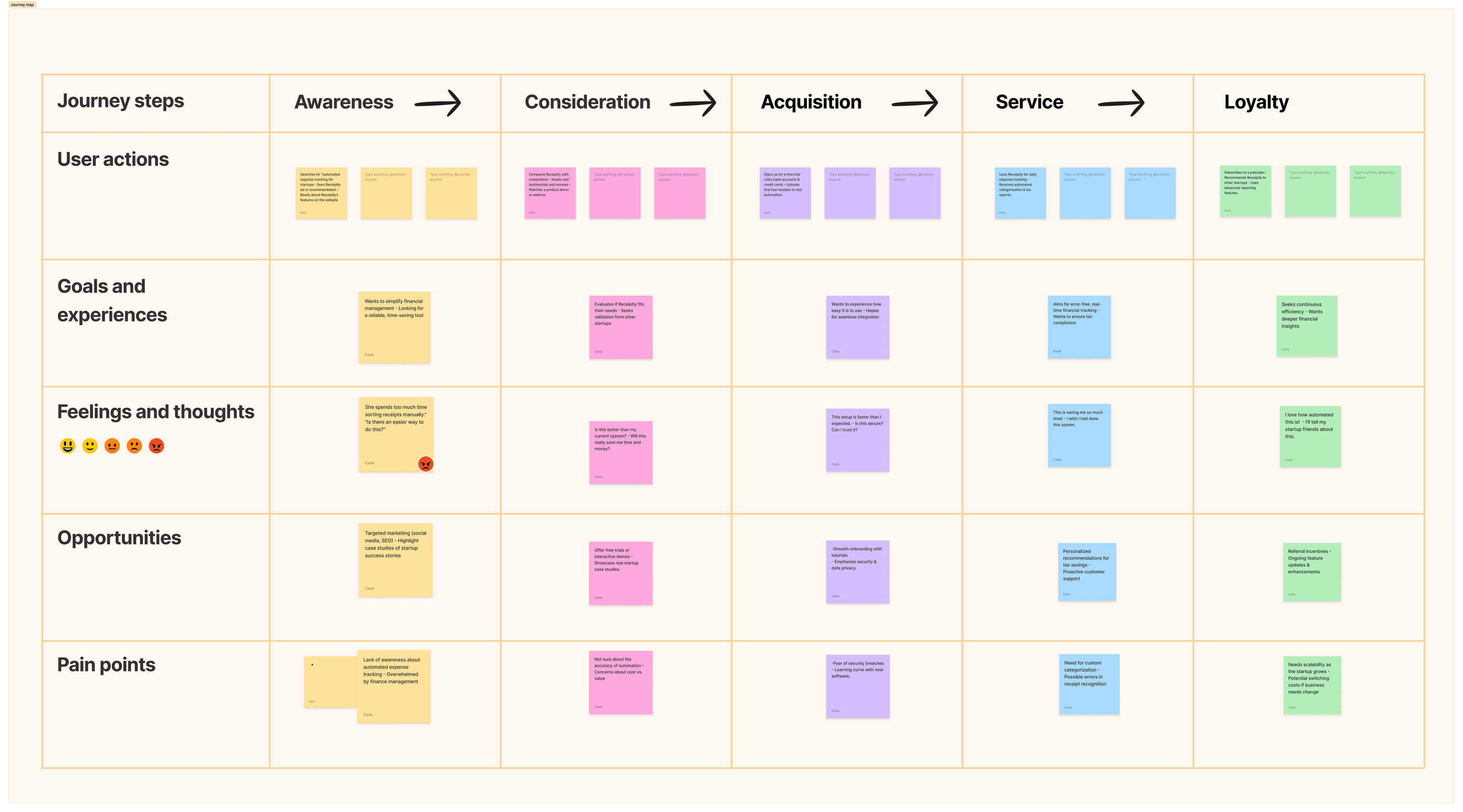
UX Design Research
We interviewed 4 startup founders and 2 freelance accountants to understand their financial workflows. One insight was clear: managing receipts and preparing investor-ready reports was painful and time-consuming.
Key Findings:
Founders spent 3–5 hours weekly categorizing receipts manually.
Reports were often rushed or error-prone.
Financial data was scattered across tools, making insights hard to access.
Implications for Design
These insights clarified that Receiptly’s value was not just in expense tracking, but in positioning users as credible, organized founders in the eyes of investors. This informed our product direction toward:
Smart receipt ingestion and categorization, reducing manual effort
Real-time, visual dashboards designed for both internal clarity and external credibility
Proactive nudges and reminders to ensure users maintain consistency before it becomes a problem
The MVP: Early-Stage Value Delivery Strategy
After multiple interviews and usability tests, we identified three primary pain points among early-stage founders:
Difficulty in categorizing expenses consistently
Lack of credible and visually clear financial summaries for investor updates
Overwhelming onboarding due to complex workflows or too many features at once
To address these, we proposed and evaluated two simplified user flows, each designed to solve a specific set of pain points within our team’s limited engineering bandwidth and prioritizing feasibility and speed to MVP.
We then worked closely with the developers to scope the technical constraints, and chose a hybrid approach between the two Flows to balance immediate impact with long-term scalability.
Main Pain Points
Inconsistent or missing expense categorization
Manually preparing decks and updates for investors
Confusing onboarding for first-time users
Second Iteration Wireframe
We created two wireframe iterations. The first focused on basic structure and key flows like receipt upload and categorization. After usability testing, we gathered insights around clarity issues and feature placement.
Based on feedback, we refined the second iteration to:
Simplify navigation for faster onboarding
Reorganize the dashboard to emphasize real-time insights
Add smart suggestions for receipt categorization

Usability Testing Key Findings
We conducted usability testing after our first wireframe iteration to validate assumptions and identify friction points.
Participants were asked to complete tasks like uploading receipts, navigating the dashboard, and exporting reports.

Insight & Iteration #1 – Upload Visibility
Finding: Users missed the “Upload Receipt” button on the dashboard.
Insight: The upload feature lacked visual prominence and was poorly placed.
Change: Moved it to the top, added icon + contrast for better visibility.
Result: 81% of users found and used the upload feature in the next test.
Insight & Iteration #2 – Clarity on Manual Review
Finding: Users were confused by the “Needs attention” label.
Insight: No explanation was given for why receipts required review.
Change: Added contextual tooltips to clarify issues with flagged fields.
Result: Users immediately understood the label without needing help.
Insight & Iteration #3 – Notification Visibility
Finding: Success message was positioned too far from user’s focus area.
Insight: Users missed confirmation feedback after saving receipts.
Change: Repositioned the success message closer to the interaction zone.
Result: Improved user confidence by making confirmation immediate and visible.
UI Design
Design Goals
Our UI aimed to instill financial clarity and investor-grade polish. We chose a clean, minimal interface with high information contrast and subtle use of color to reflect trust and professionalism.
